As LWL is a very artistic and styled magazine, it is important to mirror this aspect in our own review.
Work in progress.
Michael McGroarty
Tuesday 30 March 2010
Review Layout choices and discussion - Michael McGroarty


The uppermost image is Tom's layout draft. The one at the bottom is mine. Collectively, we have decided that Tom's is the better layout. We felt that it was more in keeping with the LWL stylistic layout. Mine was taken from a plainer review, so the layout construct doesn't reflect as aptly the unique LWL design layout. Also Tom's has the inclusion of the doodle on it, which is an important aspect of LWL. Also, he has deconstructed the review into sections; background, film, evaluation and the 3 point system. He has kept the scoring system in a separate box from the rest of the review, an important but easily overlooked part of a typical LWL review. We have decided on a single page review; our film is only 4 minutes or so, so making a double page review is both impractical and nonsensical. As such, I may have to drop the word count slightly if we want the layout to fit into the boxes. That is why the above images show only a single side. Now we have decided on a layout for our review and I have some feedback on my draft review, I can edit the review accordingly, and begin the artistic work concerning the page review itself. I will post up a basic construct of the review soon, and I will have the completed article done by the deadline on Thursday. Now the film is fully edited and on the blog, and the film poster is finalised, this is the only task we have left to do.
Posted by Michael McGroarty
Our short film - Lock In - Michael McGroarty
Here is the upload of our film, Lock In. This is where we will post general audience feedback. My own initial criticisms of the film is that it's a little short with the run time, and that in some shots the lighting is just about acceptable. Also, the sound levels change a couple of times, which upsets the flow of the film slightly. The camera is sometimes shaky, but nothing that ruins the aesthetic of the film. The strengths of the films is that it's got some good framing, and a suitably wide array of shots, considering the limited space of the location. The continuity is solid; no glaring errors, and the match-on-action that we have created works well. There is a distinct lack of music, but I feel this complements the film, although others may feel differently. I will post the video on Facebook, and get some suitable feedback. This way our evaluation will have a lot more substance.
Posted by Michael McGroarty
Monday 29 March 2010
LWL Review Draft - Michael McGroarty
Here is my first draft review in the style of LWL.
The apocalypse has always been a bleak landscape; everything from Mad Max to Stalker has had a raging undertone of human loss, despair and hatred. An operatic distortion of our reality that is simultaneously vile yet absorbing. Wide plains of the silent promise of loneliness that stretches into our minds. It accentuates human nature so it's desperate plight for survival and safety is so shocking it grounds us as we watch.
Bearing this in mind; the tears, cruel eyes and soulless faces, we come to Lock In. The most curious part of the film is that it lets us know exactly what has happened, without the painful obviousness of the traditional nuclear bomb explosion or the withered trees and streets of yesteryear. It opens with a collection of eerie shots - grimy walls, a hatch that represents the pitiful hope of escape, juxtaposed with with the impossible insanity of facing an unknown threat. Ultimately, that is the logic the characters dare not transpire. Trapped in their makeshift dungeon, pleading with themselves to leave. In the end, such bold courage does not appear, and the fear of the unknown is mulled over by the only two characters, Harry and James.
The two are brothers, and they are accompanied by Lucy, their young sister, who remains an unseen and polarised figure to them. The fear stems from their father leaving, looking for survivors. We are not given a glimpse of his uncertain situation, although we are not offered hope in the slightest. The main part of the film lies in the heart of the conversation the brothers have. At times painfully disparate and brutally melancholic, the characters have an air of ebbing frustration eating away at them every time the other retorts. We can tell they are worn down by their circumstances; never more so than the violent physicality of James, who's coiled viper act contrasts with an earlier, lost rambling child pantomime. In contrast, Harry is a level-headed, stable character, although his mental flaws are exploited by his very longing for the truth.
It is here, that we, the audience, become torn. We feel the torment of their isolation, yet we urge them to step outside with a grand panache. We can't help but think that there both a little cowardly. Obviously in the absence of their father they have had to play an ever-burgeoning role of the father to Lucy, but it is also clear that she is as much a responsibility as an excuse.
Their increasing vicinity to each others natures is enhanced by the stillness of the camera. The framing is compact, nothing is left to waste. While you could say the cameras statue like quality is a let-down, its lack of kineticism perfectly mirrors the obliterating depression and solitude in the cellar they dwell within. The table is lit by a single candle, and while this shining beacon could be perceived as a ray of hope, it's more a constant reminder of the brighter days. The lighting itself is contentious. While the drab, low-key lighting schematic works to emphasise the dreary setting and mindset, one can't help but feel a little underwhelmed by its plainness. However, producing a stylised, chiaroscuro lighting would have downplayed the foulness of the whole piece; the construct of male fear and cowardice, the constant surreptitious hopelessness or the volatile nature of the human being.
Anticipation: an unknown quantity. First time directors collaborate. 2
Enjoyment: as good an expression of the gradual loss of soul as any. 4
In Retrospect: not a conversation starter, but still an emotional glass tank. 3
Word Count = 598
Posted by Michael McGroarty
Friday 26 March 2010
Review and posters. - Thomas Brown
Well after a hectic rush this week we have managed to get most of what we need to do done. The poster is ready as is the film, And expect to see the Review posted up by Michael very soon, I will post the decided poster with Analysis. The Evaluation of our finished product should be complete soon.
Thursday 25 March 2010
Finished poster - Thomas Brown & Michael McGroarty
 new
new
This is the poster that me and McGroarty have decided upon, I created it in InDesign with some slight work in Photoshop as well. I decided to keep with the theme of keeping most of the poster clear with the darkness, in order to extend the feeling of loneliness. We also decided to combine the awards because it created less clutter. Our initial thoughts was that the top left corner was too cluttered, but when we looked at the poster as a whole, rather than concentrating solely on the title etc, it contrasts quite well with the darkness of the image. The award we decided to incorporate in was at the Edinburgh Festival, and we settled on just the one award because otherwise the poster would become too cluttered. We just need to include a credits block at the bottom, and maybe put in another funding company.
I have now updated this post with a new poster, featuring new fonts and a new screen-block which credits everybody involved with the film.
Concerning our choices regarding the poster, we felt the element of simplicity matched up with the basic premise of the film. Obviously we're making a socially realistic post-apocalyptic drama, so a flashy or overindulgent poster wouldn't marry up with our target audience. The single image of the lone figure drenched in darkness retains a lonely yet mysterious edge. It is also quite a powerful image; as stark as it is real. The use of white for the title, actors etc was made to contrast with the darkness of the main and only image. As for the font itself, we chose it because it seems to be crumbling and broken, which we felt worked well with our genre choice. We chose to include Film4 as a funding company because they do promote and fund small films, which fits in with our film very well.
Second Time Editing - Michael McGroarty
We uploaded our re-shot footage into Final Cut Pro; unfortunately it uploaded in one massive 31 minute clip, which meant that we had to go through the process of cutting it up, and deleting the parts we couldn't use. Through a combination of our efforts, it took about 3 hours to cut the footage down to about 10 minutes. After this initial setback, it was a simple task of using the best shots. We filmed in sequence, so piecing together the clips was easy. As we have a lack of camera movement, I wanted to have as much match-on-action as possible. Therefore, rather than having a cut at the end of each line, I cut between two shots mid sentence. Initially this proved tricky, as this is quite difficult to do without spoiling the natural flow of the dialogue. However, after several cuts, I had created a good dialogue match over 2 cuts. There was some trouble when an essential shot hadn't been filmed; there was footage at the beginning and at the end of the scene, but no actual footage of it. It involved me sweeping away the bottle-caps and having my head in my hands. The first take, after I swept away the caps, I got up and walked to the wall. However, we realised it'd be too difficult to film from the new position, so we decided to have me put my hands over my head. This shot was the one missing. To avert this disaster, I cut off a short clip of the other actor, and put it in after the take of me just about to get up. I cut early, and dragged the sound over to the reaction shot, so the sound continuity was good, and you don't see me walk away, so the physical continuity was good. The edited footage ran to 3 minutes 16 seconds. This wasn't too short; our last footage ran to 2 and a half minutes.
I kept the dialogue snappy. Some of the takes dragged towards the end, the pauses were too rigid, too thought over. It didn't have the realistic flow of a conversation. So I cut it down, made it sharper. We opted not to have a soundtrack, and we didn't need to add in any diegetic noise, so the use of GarageBand was obselete. We completed the editing in around 6 hours.
Posted by Michael McGroarty
Wednesday 24 March 2010
Little White Lies review examples - Thomas Brown
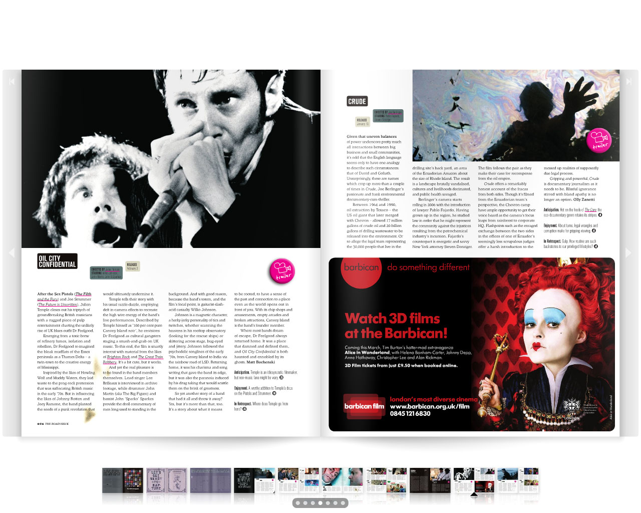

Here are some examples of Little White Lies reviews which feature their very specific design of each issue. The issue in use here is The Road (2009) issue, taken from the on-line site. The dirt and drab pages are representative of the post apocalyptic nature of The Road. We hope to follow this style in our own review. There numerous doodles and old-age guilds that are on the pages are representative of the post-apocalyptic nature of the film.
Tuesday 23 March 2010
Lock in poster - Thomas Brown
 new
new

These are my more reviewed suggestions for the poster.
I Personally prefer the 2nd upload, As it Gives the image more space and adds to the lonely emphasis of the picture.
I will collaborate with Michael to decide upon a final product which we will then produce.
EDIT: I have added a new poster using a different font.
LwLies Layout. - Thomas Brown
 Above is a basic wireframe layout of a Little White Lies review, They all follow a very similar style, with the image covering 3 or 4 of the columns, usually 4 on the full page reviews. We have decided to include a doodle to fit with the style of whichever copy is out at the time of printing, Currently this is the Kick-Ass Issue.
Monday 22 March 2010
Shoot 3 - Michael McGroarty
We filmed for the third time on Sunday 21st of March. The shoot went considerably better than the previous two shoots. The lighting was a lot better than last time. The redheads, while initially being quite hard to create the right effect with, soon became easy to use. We had both redheads on, with one shining into the cellar room with the white filter, and the other redhead facing at a right angle away from the cellar just to heighten the light a bit. We played back the footage to check the light was okay; the characters were visible. Unfortunately, one of our actors pulled out the night before the shoot, so I had to be in the film. This meant the camera work was left in the hands of Tom. We kept to the storyboard, and improvised some shots, although due to the limited size of the cellar, having a wide variety of shots was impossible. The script this time round was longer, so when it comes to editing we'll have a lot more footage to play around with. last time we shot 10 minutes of footage over 3-4 hours, this time we shot 40 minutes in two and a half hours. Last time I edited our film, the finished product came to 4 minutes 6 seconds. Now the script is longer, and we can put the voice-over at the end, along with the credits which we will have to make shorter this time, the film run time should hit the 5 minute mark.
We shot the film line-by-line, and from roughly the same areas, so shooting the dialogue was done within a couple of hours. Afterwards Tom filmed a few establishing shots around the cellar; the barrels, a decrepit wall and the candle on the table. Looking back on the footage on Final Cut Pro, the footage is a lot brighter, and while some of the shots done hand-held are a tad too shaky, good editing should dumb down the shakes. The tripod shots are nice and stable, and because we didn't move the lights at all during the shoot, the lighting and shadows are consistent in each shot.
Posted by Michael McGroarty
Friday 19 March 2010

Thursday 18 March 2010
Equipment - Michael McGroarty


Seeing as we're employing the use of redheads, I thought it'd be appropriate for me to do some research into redhead lights. Above are a couple of pictures of the head of the lights. It is one single torch fixed on a tripod stand, much like a tripod. Normally the legs are thin, so they need to be held down with sandbags, so it doesn't fall over and smash. A common sight is to see cables taped down to the floor; this acts as a safety measure; loose cables will inevitably end in disaster. They also get very hot as they commonly have a wattage of 650-1000 watts.
As for the light itself, it is very bright. However, the good thing about redheads is that they have 4 'barn doors' built around the light. Not only does this act to spread the light evenly, it also allows the user to narrow and widen the light accordingly. This makes it much more effective as oppose to torches, because they can be manipulated a lot more. They are also powered off plugs, so they last longer than torches.
The redhead is the staple of the film and TV industry. They are a general purpose light; whether it be as a fill, back light or as a flood light for larger areas. Multiple redheads can be used at once, and when used correctly can capture some great shots.
Posted by Michael McGroarty
Initial Poster Idea Sketches - Michael McGroarty
I have sketched a few ideas for our film poster. They are not massively detailed. I will upload them tomorrow from college.
Posted by Michael McGroarty
Posted by Michael McGroarty
Wednesday 17 March 2010
New Script - Michael McGroarty
A quick note; dialogue in square brackets denotes an inward reflection as oppose to a right out sentence. It is still spoken, but as if to themselves. Circular brackets act as stage directions of a sort.
James: (head in hands) 4 days. 4 days..where the hell is he???
Johanne: James..don't start this again...we've been over this.
J: [He said he was just gonna see what happened...I know how much he missed the outside]
JH: I can't say I'm not worried [of course I am], but he's alive James...I can feel it in my-
J: I don't care about your stupid feelings! I just want to know where he is! We have no idea what's out there, he's charged out there with-
JH: I know James. [I did everything I could]. No one could've stopped him. (Sighs).
J: [I wish he never went]. If I saw him right now it wouldn't be soon enough.
JH: He's coming back James..I just know it. Don't worry..you know what he's like. Knowing his luck he's probably found survivors out there. [I don't know what I'do do if he never came back]
J: Mum, I'm not going to kid myself that he's found survivors and is having a bloody good time out there.
JH: James don't be ridiculous. You know I don't mean that. He's impulsive...as soon as he found people he..
J: Exactly. I know he's impulsive but he's not gonna let us stew here. How can he do that with Lucy here...he never would.
JH: [Yeah...it is unlike him]. But you can't just give up on him.
J: It breaks my heart every time I see Lucy look at the hatch, [it's not fair on her].
JH: (looks away) ...Every day he's gone...[I love him so much]... (head in hands)
J: Mum...[goddammit..]
JH: [I wish he was here...I wish I could feel his touch..] It's useless...wishing.
J: Don't be like that Mum..you need to stay strong..for Lucy..[and for me].
JH: You know I promised him I wouldn't go out there if he never came back. It's almost like he knew...
J: [I don't want to believe it]. He wouldn't just leave us here..I mean..he just wouldn't...
JH: Who knows what he was thinking..we were all getting irrational..
J: It's no excuse, you don't desert family, not now..[you just don't do that]..
JH: Look..try to stop thinking about it-
J: This isn't just some guy we're talking about here, it's my Dad, I can't just switch off my thoughts..we have absolutely no idea what the hell has happened out there, it's been silent for 4 days, not one sound, it's like the world has just vanished..
JH: James, you're not doing yourself any favours, just get some sleep and-
J: I can't sleep now! I haven't slept since he's left! Jesus Christ, what do you think I am?! How the hell can you expect me to rest while he's out there! He could be dead right now! Face down in the dirt, killed by some scumbag!
JH: You don't think I know that James?! Every time I think about him my heart drops. [You wouldn't understand].
J: Oh for God sake! (sweeps away the chess pieces)
JH: (waits a few seconds) James...we can't do anything about it..
J: I know. It doesn't mean I wish I could..I've never felt so hopeless..so useless..
JH: I know it's not easy for you, it hasn't been easy for any of us..but the more you think about it..the more it'll eat away at you, and you can't let that happen, Lucy needs you..I need you.
J: (sighs) I'm sorry Mum, it's just, you never expect your parents to leave you..I mean..I thought he'd be around me my whole life..I always saw myself standing next to him at my wedding, smiling and joking..but now that seems impossible and seeing him for the last time feels like a thousand years ago.
JH: (looking intently and sadly at James) I know James, I know.
J: What will Lucy say..she'll realise soon, she's smart, I can't lie to her..
JH: We can't betray her, but she's still a child James, she couldn't handle it if he didn't come back..she loved him terribly..they were inseparable..
J: [He's not coming back..](sighs)
JH: Come and sit down James..please.
J: (walks back to the table)
Voiceover starts here. The voiceover is the same form the last script.
Posted by Michael McGroarty
New Start - Michael McGroarty
Today we were granted an extended deadline due to the lighting in our film. Our tutor said it was unwatchable, so he granted us until next Monday to get it filmed. Therefore, rather than opt for a Level 1 mark, which will secure an E grade, we are opting to shoot again at the weekend. This time we have redheads for our lighting. This will hopefully mean our lighting will be of a good quality, as we have learned that work lights and torches with no gels doesn't work at all. The redheads can be manipulated a lot more; they have gels and diffusers, and the 4 boards surrounding the light can be narrowed and widened for specific purposes. Hopefully this will serve the function we want this time round.
I will also add more to the script, give it a shuffle around. We needed more dialogue' not much, but enough to get it up to an acceptable level of run time. I'll also get rid of some lines that didn't work very well. I'll make it snappier, coax some emotions out of the dialogue. This time I'll write out the shooting schedule' the storyboards got confusing quite soon into our last shoot. This means our footage, poster and movie review will all have to be done for the 1st of April. Below is a list of our tasks that need completing, in no particular order:-
I will also add more to the script, give it a shuffle around. We needed more dialogue' not much, but enough to get it up to an acceptable level of run time. I'll also get rid of some lines that didn't work very well. I'll make it snappier, coax some emotions out of the dialogue. This time I'll write out the shooting schedule' the storyboards got confusing quite soon into our last shoot. This means our footage, poster and movie review will all have to be done for the 1st of April. Below is a list of our tasks that need completing, in no particular order:-
- Filming done on the weekend
- Editing completed ASAP
- My initial poster ideas
- Organisation for a poster shoot during next week
- Research on Little White Lies completed
- Development of poster analysis
- New, improved script
- Shooting schedule
- Shot changes noted
We need to nail this one in a few hours, so we have to be efficient during our shoot.
Posted by Michael McGroarty
Tuesday 16 March 2010
Last Day of Editing - Michael McGroarty
Filming so late has meant our editing hours has been cut down severely. Today is 'mopping up' day; the project is finalised and rendered. All we have left to do is record the voice-over of Lucy. I recorded my voice for the emergency radio broadcast, and got it up to pretty much 30 seconds. The credits have been completed, although they are their merely as a filler and not as a creative ending. They run for 30-40 seconds. We are trying to bump our time up; our edited footage a couple of days ago was 2 and a half minutes. With the addition of the credits and voice-over it is now 3 and a half minutes long. This is still under the 5 minutes quite severely, and we have no more relevant footage to stick in to juice it up a bit. I will also have to load the project in GarageBand, finish the music, and render it all. Depending on the length of the voice-over, I may have to shorten or lengthen some of the shots the voice-over layers over. The chances of me getting it bang on the same amount of time is minuscule, so chances are extending or reducing shots will have to be done. We have an unusual amount to do considering the hours we've put in, but nothing has gone our way. During editing today, the credits slipped in the time line and eradicated a lot of our footage. We couldn't retrieve it, so we had to close Final Cut, go back in, and do the credits all over again. These little mistakes cost us 15-20 minutes, which we need to finish the film.
For our music, I have layered several different things. The music enters when the credits do, and I have gone for a slow piano tune, along with a subtle heartbeat and an intense undertone.
Posted by Michael McGroarty
For our music, I have layered several different things. The music enters when the credits do, and I have gone for a slow piano tune, along with a subtle heartbeat and an intense undertone.
Posted by Michael McGroarty
Sunday 14 March 2010
Little White Lies - Michael McGroarty
Little White Lies is an independant film magazine. They review the latest releases in film and DVD. Online, they also have exclusive interviews with stars such as Vincent Cassel of La Haine and Mesrine fame, JJ Abrams who did Cloverfield and Star Trek. However, they also interview lesser known people such as first time directors. They sell 6 issues every year, much. The good thing about LWL is that they aren't influenced by hype or public opinion. No fanboys etc. As oppose to the larger magazines, LWL uses a cartoon image of a current film every front cover. There first issue had Bill Murray from The Life Aquatic on it's cover. It's current issue, number 27, has Viggo Mortensen from The Road on it. This helps create a distinct, visually arresting theme with each issue.
The thing that sets apart LWL is it's charismatic, self-indulgent artistic front covers and pages. An interesting thing about this is that whatever film appears on the front cover creates a running theme for the rest of the issue. For example, one edition had Spike Jonze's 'Where The Wild Things Are' as it's cover film. In keeping with the childish subject matter of the film, there are numerous child scrawlings on reviews and other pages. Also there are relevant typographical symbols by the page numbers; in this case a little crown, as the boy in the film is crowned King of the beats. While this vanity project may be needlessly expensive, it does add a different flavour and aesthetic to the magazine, setting it apart from the likes of Empire and Total Film.
LWL has a tricky target audience, tricky in the fact it's hard to pin down specifics. LWL isn't just a film magazine, it transcends all aspects of modern culture and utilises them to create a different kind of film reaction. LWL say themselves:-
'Because movies don't exist in a vacuum, we venture beyond the boundaries of the big screen, exploring the worlds of music, art, politics and pop culture to inform and illuminate the medium we love. Bold, beautiful and unique, LWL is a magazine on a mission - to reshape the debate across the movie landscape.'
While a normal review will delve deep into the dynamics of the film, it won't stray outside of it. This is where LWL is different once again. By utilising the numerous aspects of culture, they shape a more profound, complex review. The most interesting part about the LWL movie reviewing process is it's evaluation system, which occurs at the end of every review. It is a 3 way system. They split it into anticipation, enjoyment and in retrospect. Anticipation is an oft-overlooked aspect of film. The hype of a film, whether it be through the media or your own mind, can seriously influence the enjoyment of a film. For example James Cameron's Avatar was stuck in production hell for 12 years before getting a release. The media sensation it caused; whether it'd be the biggest film of all time or the highest grossing film of all time; was astronomical before it's release. A film can reach the dizzy heights of 'fever pitch', but anticipation can be a double edged sword. Enjoyment is the viewing experience. If it was a thriller, did it have you on the edge of your seat? Did it grip you and not let go? Or did it allow a quiet time to nap in the darkness of the cinema? This ties in with anticipation. If you see a film you've been dying to see for months, maybe even years, and it falls flat, the height of the anticipation to the dark pit of the lack of enjoyment is often more devastating than a rudimentary dislike of a film. Therefore anticipation affects enjoyment, and the combination of these two affect the retrospective part. This is the most notable part of the film experience. People can often recount their most vivid memories with ease; whether it be a concert, holiday, or a once in a lifetime experience like the Northern Lights or skydiving. Films work in the same way. Sometimes the best film is not the most technically proficient or the film that walked away with all the Oscars, it's the one that resonated most in your soul. It stirs up forgotten memories or uncovers lost loves, buried burdens or drowned passions. A film can change lives, and having a retrospective opinion allows you to grasp how good the film actually was. It's the most important part. We can tell from this type of 3 tiered review system, that LWL revels in the pleasure of film, as oppose to a robotically formulated opinion, all correct in it's parts, but lacking a certain intimacy.
LWL language in it's reviews is complex; not exactly the type of vocabulary you'd find in The Sun or the Daily Star. A review I read for Martin Scorcese's Shutter Island uses complex language and references that is only for the film-literate. Phrases such as 'dripping with Hitchcockian nuance' and 'chiaroscuro lighting that intensifies the feeling of claustrophobia resonating from the prison' all highlight the fact that LWL is aimed at 'movie buffs'. Hitchcock being a famous director of numerous suspense film and chiaroscuro lighting meaning bold contrasts in light points us to the fact that an average movie goer would not know the references or understand the film terminology.
The website has a section entitled 'Friends of LWLies', in which it's sponsors or company acquaintances are listed. There are several film festivals; Leeds, Edinburgh and Raindance all show that LWL's target audience is again geared at more film accustomed individuals; it is not sponsored by large, big name companies, because this would contrast with the copy in the numerous editions of the magazine. Looking through one edition, there are sponsors from Fenchurch, Swatch, Land Rover, Canon, 20th Century Fox, Optimum Releases, Rockstar Games, Playstation and Electronic Arts. Without generalising too much, these are more male orientated products. Fenchurch is predominantly a male brand, Land Rovers are male enforced cars, macho in their size and engine brawn, Rockstar and Playstation are obviously appealing to male gamers who like deeply plotted violent games; these brands could be considered art in their own right, much like LWL itself.
Posted by Michael McGroarty
Friday 12 March 2010
Editing Progress - Michael McGroarty
The footage, as I mentioned in the last post, is too dark. Therefore editing is currently a tricky affair. Some shots we thought looked good on the camera are unusable. Piecing together the footage is tough. We also have some problems with continuity which we have smoothed over. One shot in particular with Lawrence walking back to the table was not complemented by the next shot of him sitting down. We rescued it by having a reaction shot of Claire.
The filming didn't turn out well, so it is having a detrimental progress on our editing. Splitting up 45-50 second takes into 5 second segments, then piecing them together in order while maintaining continuity is a time killer. In hindsight, it would have been easier to film each few seconds of footage separately. This way editing would take half the time. Also because the shots are so dark, seeing if the continuity is correct is nigh on impossible. We tried adding an effect to brighten the shots, but it looked like a grainy nightmare, and it just made it look cheap and rubbish.
We also started progress on the credits, although they look uninspired and boring so far. A black background with white fonts in plain lettering does nothing. The various movements the credits can have like scrolling or fading don't fit in with the aesthetic of the film. We wanted it grainy and flickering, much like a candle. Trawling through the effects one by one takes its time, but the credits are an important part of our film, so we can't brush them over. As we are low on footage, padding out the credits will be an important aspect to bump up our run-time.
The software we're using to edit is Final Cut Pro, which initially was hard to use. But after an hour or two learning the techniques, it is more in-depth and intricate than iMovie. The only problems we're having is splicing the various different pieces of film without deleting clips or delaying the audio. So far the editing has taken an inordinate amount of time, considering we've only just managed to order the clips. Making the conversation sharp took time. With the rolling, action and cut actions during filming, there were some unnecessary gaps where the dialogue lagged and became boring and unrealistic. We need to make sure that the voice-over gets done as soon as possible. The main bulk of the film is the voice-over; it takes up a solid couple of minutes run-time, so it is vital we get that recorded before the deadline. After layering it over the top of the scenes, we can mute the actors talking in the long takes, and have the voice-over provide the dialogue. It is working out to be a complicated technique, we should've recorded the voice-over first, and then shot it according to the length of it, but we've done it backwards which has made it more complicated.
Concerning music, I was thinking of a piano or some other kind of classical instrument playing over the credits to lend a grave, solemn tone to the film. Added with the grim titles, it should help set the scene for the rest of the film. A concern I have is that the music will play second fiddle to the editing together of the film, and it will be overlooked and our film will have no music at all. GarageBand will be the ideal program to use; there may be pre-recorded clips of piano, or if not, we'll have to make it ourselves. Concerning the specifics of the tune I have in mind, I was leaning towards Beethoven's' Moonlight Sonata as a source of inspiration. There is a link to it on YouTube here:- http://www.youtube.com/watch?v=vQVeaIHWWck
It is a melancholic, slow tune, which is the mood I was looking for. It's also a slow piece, the notes themselves are played with a slow deliberated touch, and as a result creates a sadness to it without being over-dramatic. As for music during the scenes, I was leaning towards a no because it'd take too long to fit music too it. Having to re-shoot several days before the deadline has severely cut our editing hours we could have had. As a result, some of the areas of our film will not be as developed as we'd like.
The lighting is the most noticeable aspect of the film that has gone very wrong. The original shoot had work-lights which were impractical and much too bright. Our second shoot we had torches and gels, although the gels were misplaced and again the lighting became an arduous chore. Our first shoots footage is too dark, grainy, blurry and overall a disaster. Our second shoot was a bit more successful, but nowhere near to the calibre I wanted it. This was due to the absence of the gels. Once again we were limited to lighting from one place, as we couldn't light from where the actors were sitting because the room is too small and the precise, bright beam would have been much too noticeable.
We have gone with keeping simplicity as the key by only using straight cuts. Fades were out of place, dissolves were unnecessary as there is no lapse in time or place, and a wipe is too comic and out of context to use. Therefore the straight cut is our chief tool. Something that isn't so simple though is the sound levels. As we were filming by a large fridge, the hum of it can be heard in every shot. Often it overtakes the dialogue and ruins the shots. Each shot will have to have that taken out or lowered individually. A couple of shots the fridge's hum is absent, so we have to lower them all to keep the continuity going.
Overall, the editing has been a hard task so far; our shots aren't lit well, the camera movement in some shots is so wild and jerky that some of the shots are destroyed as a result. No amount of editing could save them. Some of my storyboarded shots had to be scrapped which cut down our run time. I originally storyboarded a 5 minute film with around 50 shots. By the end of the second shoot we had maybe 25 shots filmed, with the ones we hadn't filmed being too hard to pull off. The tracking shot for example; the lighting would have been impossible. This had a knock on effect, we are now under the appropriate time objective for our film. This was both a failure in communication and realism. Some shots we agreed were from too awkward an angle in the cellar to pull off, so we improvised and kept the time up. We also failed to communicate our doubts over certain shots; I storyboarded alone, including shots of the young girl in the film. However, it came to light when shooting that in fact this was impossible, so around 10-12 shots had to be taken out there and then. The end product I'm hoping will be better than the product of it's parts.
Posted by Michael McGroarty
Wednesday 10 March 2010
Poster Ideas - Michael McGroarty
I am leaning towards a separate shoot for our poster, as oppose to using a still from the film, as the shots are too dark. A separate shoot with a high quality camera using proper lighting would be much better and ensure we create a decent product. I have also been thinking of styles to use, and which awards to include. It is important not to go overboard by lavishing a dozen Oscars and BAFTA's on our film, so a simple Jury Prize at Cannes or a Palme D'or award, like a Silver Bear or something would be better.
Posted by Michael McGroarty
Posted by Michael McGroarty
Filming Session 2 - Michael McGroarty
We filmed on Sunday the 7th of March. We hit problems early on when we found out that the gels that we would have used with the torches had been lost. This made our lighting difficult once again as the torches have a high powered beam. It is easy to tell where the lighting comes from and where it hits. The gels disperse the light evenly, which means we can manipulate the light easier. Unfortunately, as we were missing the gels, we had to bounce the light off various objects. Some shots were very difficult to film because of these problems.
We decided to re-shoot most of our shots from last time, as the footage from our first shoot was too grainy, dark, and blurry. Generally, the footage was a small disaster. We kept the continuity up; the actors wore the same clothes, we set up the makeshift table in the same way and place, and we used the same candle. We also had the XM2 camera; the high quality one. The footage we got is significantly better than last time; it's sharper and more clean looking. However, due to the difficulties with the lighting, some of the shots are a tad too dark.
This shoot was a lot quicker than last time, although the absence of light all the time was a slight hindrance. We could have used the torches for light, but they only had a short battery life; 45 minutes tops, so we had to conserve the power. If we ran out of battery power, the shoot would have to end; maybe sooner than expected. As it turned out we were very conservative with the torches, so they didn't run out on us.
Our actors remembered there lines well, so we didn't have to shoot each take too many times. We went for a safe 2-4 takes for each shot. This way we have plenty to use when it comes to editing. Like the last shoot, we only shot from 3 or 4 different places; the cellar this time had more barrels, so we were restricted somewhat by the extra barrels. We moved a few of them, and we freed up some room, but only enough to shoot from those limited places. The room itself has a low ceiling, and it isn't too large even without the barrels. We can't shoot out of the room because then the light that was perpetually on would have conflicted with our post-apocalyptic-no-electricity vision. Also the lighting would have been ridiculously hard to pull off professionally. Learning a lesson from last time, we shot all of the shots from one place in a row as oppose to shooting in sequence. This was a major factor in our speedy filming session.
Posted by Michael McGroarty
Tuesday 9 March 2010
Fish tank Movie poster analysis

Fish tank has two movie posters, this one is from the earlier release of fish tank, And portrays the film in a very different way.
The title is Bold and Stands out a lot, it is very conflicting with the rest of the poster, Which helps make it more noticable. The words 'The most honored british film of the year' Really help sell the film, Use of the word honored over Best film of the year shows that other people have shown recoginition for the film. It also establishes the film to a different target audience, As the recognition shown might make a more film literate audience to view it.
The Awards it has recieved are made very prominant. With some very illustrious prizes such as Festival De Cannes, which the more film literate audience i mentioned earlier would be very interested in, With Cannes being one of the major film festivals.
The Background mainly shows sky, however in the bottom left corner their is a city, This gives a subtle hint towards the films setting, this could give the audience more information about the film. The costume used by the character is very different to the one used on the other poster. Her jewellery is Bold, with large hoop earings and a gold chain. The character looks Worried or intrigued, This paired with the character stareing off camera, makes you inquisitive, As you wish to know what she could be staring at that would give her such a look.
They have chosen to use a Medium shot instead of the Medium close up used in the later poster, This shows more of the character and her surroundings, She also takes up a much bigger percent of the page, Upo to 75 %, Which makes it clear that she is the main focus of the film.
The review given by Time out london praises the film highly, Which c ould influence a more Arts directed audience, As they have a good reputation among the creative, And interview many famous directors / artists / musicians.
Friday 5 March 2010
Lock in poster suggestions

I decided to design my suggestion against an Orange background, In order to make the Fonts stand out more. I Thought that using The screen block in a more interesting way might help to create some interest for the film in the passer by, Using the black font against the orange made it look like a warning, Since this is a post apocolyptic film this seemed an interesting path to go down.
By Thomas Brown
Thursday 4 March 2010
British Film Posters


I have recently looked at 2 British film posters; Fish Tank and This Is England. Both films are low-budget, social realism films, made in Britain, by British directors starring predominantly British actors.
Fish Tank used two promotional posters, but the one shown above is the better of the two. The first thing to note is the image. There is only one image, which we can assume is the main character, a teenage girl. She is looking out of what seems to be a window. We can gather a lot by her setting and costume. The wallpaper in the background is torn, and has a scrawled love heart on it. We can tell from this that she lives in a more deprived neighbourhood; middle class families wouldn't let their walls be in such a state. Also, the scrawling signifies that her parents or guardians don't care about where they live. It also signifies that the heart may have been there a while. Wall drawings are a child's pursuit, so we could assume she's been yearning for love in some form for a few years. This is rein-forced by the torn wallpaper; no one cares. Furthermore, her clothing is simple and cheap, along with her necklace. We can tell that her outfit and jewellery is imitation gold, and the top she's wearing is not exactly designer. This further adds to the fact she is probably from a poor neighbourhood; maybe an estate or an ugly block of flats in suburbia. The tagline, 'Live, love, and give as good as you get' tells us a lot about her character. We can only assume the tagline refers to the girl in the poster. It suggests that, particularly the second half, that she doesn't suffer fool's gladly; she'll give you everything you give to her. This makes her character seem strong and free-willed.
The use of colour on the poster is quite intriguing. The use of pink and blue suggests a couple of things. For one, pink is stereotypically a girl's colour, and blue a boys colour. By mixing them, maybe it is illustrating she is a tomboy, or has strong male characteristics. It also surreptitiously appeals to both males and females. Not one of either colour is dominant, they blend quite harmoniously, so it's not some Barbie pink fest, without being a lads film. It splits the difference nicely. The film title itself is in big, bold letters. The film reviewers comments are also large on the poster. 'Powerful and poignant' is good alliteration, and for each review, the most provocative words are larger than the others. Again, this is a low budget film with little known actors; their names won't make people see it but the positive comments will. This is highlighted by putting Katie Jarvis, Michael Fassbender and Kierston Waering in smaller font than the comments. Only the film buffs will know who they are, but a distributor can't rely on that alone. Andrea Arnolds name is also featured just above the film title; generally in British cinema, the directors name is featured as often their names are sometimes more recognisable than the actors they're directing.
Like most other film posters, it makes use of prestigious awards it has one. Films that have won awards; Oscars, BAFTA's and so on. In this case it won Best British Actress at the Edinburgh Film Festival in 2009. It also won the Jury Prize at Cannes, one of the largest film festivals in the world. Many people know of Cannes, so they can recognize that it takes a good film to win the Jury Prize. The target audience for this film would be anyone from late teens to middle age. Although the focus on the film is on Katie Jarvis character, it's not primarily aimed at just teens. It might focus on teens, but it has adult situations, and older actors like Michael Fassbender. So while initially it may seem like the main character influences the target audience, it's never that simple. Looking at IMDb, Fish Tank has a total of 2,834 votes. They're not all from teens and twenty-somethings. In fact most of them are from 18-45+ year olds. The average ratings are around the 7-8 area, so even people over 45, who you wouldn't think would enjoy a film like this, actually do. While this is just a small cross section of the audience, it does offer an interesting glimpse into who watches films and what they think of them.
The second film poster I analysed was This Is England, a film by Shane Meadows. Shane Meadows is a big name in British cinema, after his 2004 film dead Man's Shoes was received well. He has since made his name by making socially realistic gritty dramas. This Is England is no exception. The image on the poster says a lot about the film. The most evident thing is the 11 characters that are all lined up by the corrugated iron fence. Some of these characters are skinheads, there are 5 women, and 5 men including a black man, and a young boy. The skinheads draw the attention first. The film is obviously going to be about them. Their costumes; doc martins, bomber jackets and short jeans all fit the era the film is set in; Summer 1983. The setting also says a lot about the life and times of the characters. In both top corners, there are blocks of flats.
Colour is important in the poster. The title is written in the three colours of the British flag; red, white and blue. This rein-forces the whole British theme of the film.
Posted by Michael McGroarty
Subscribe to:
Posts (Atom)
