For our short film, we chose a crossover of the following 2 genres:-
• Social realism (in this case, a drama)
• Post-apocalyptic
The first thing to mention here is the influence of British directors. My own influences strayed beyond British directors, but that will come later. The directors who have influenced me are as follows:-
• Andrea Arnold
• Mike Leigh
• David Lean
• Danny Boyle
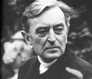
The first director I will talk about is David Lean, pictured right. Here is a link to his biography, http://www.bfi.org.uk/lean/intro.php?isec=biography. I have taken it from the British Film Institutes website. David Lean is one of Britain’s most important directors, and Brief Encounter, a romantic drama set during war-time is especially brilliant. Directors should break or challenge social rhythms, social classes and the social mind state. Lean created a controversial piece with Brief Encounter because of:-
• Laura Jesson (Celia Johnson) is tempted to cheat on her husband with a doctor, Alec Harvey (Trevor Howard).
• The way the situation is depicted, the audience feel like this is a good thing.
This link, http://www.youtube.com/watch?v=hubyFqSUaGA, is of the last scene of the film. It is here that the audience feel a strong emotional reaction as Laura and Alec part ways, forever. The scene is bittersweet; we feel sad for their break-up, but relieved that she didn’t cheat on her husband. Lean was very much ahead of his time, showing the nature of temptation and the deceit that it brings. The way the nature of love is depicted is partnered with the moral and social conscience of Laura, as she grapples with her own ethics. Concerning these themes, Lean influenced me in the following ways:-
• That challenging social forms can be done through a simple story.
• That social ethics change with the times, but can be accentuated during certain periods. For example current day Britain is a lot more open concerning sex and marriage than during WWII.
• That the characters must remain sympathetic and relatable, even when there moral compass is off.
While I couldn’t emulate the technical prowess or artistry Lean creates in his films, the conventions of the socially realistic film he portrayed in Brief Encounter was invaluable.
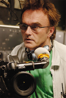 The next director I’d like to talk about is Danny Boyle (pictured right). Danny Boyle is a strange director. He is very much like Stanley Kubrick in that he is a genre hopper. Below is a list of some of his films and their genres:-
• 28 Days Later – Horror/Thriller
• Trainspotting – Social Realism/Drama
• Millions – Comedy/Drama
• The Beach – Adventure/Thriller
• A Life Less Ordinary – Fantasy/Romance
I have chosen these 5 films because they vary so much. Trainspotting and 28 Days Later are both socially realistic films, with the latter incorporating the horror theme, whereas Millions and A Life Less Ordinary are charming fantasies. The Beach was his first film abroad, and it’s like nothing else of his film projects.
Here are a couple of clips from his films I feel are relevant concerning my own piece:-
• http://www.youtube.com/watch?v=sBZnuUZIbBQ – the reason I have chosen this is only for the opening 30 seconds or so. Even though it is set post-infection, meaning there are no people around, his setting and character are still relatable. The use of Big Ben and the distinctive red buses allows the audience in, and making the character an ordinary man in an extraordinary situation in a recognizable setting doesn’t alienate or subdue the audience into thinking it’ll be just another brainless zombie flick with tons of blood and no humanity. This is also relevant because it concentrates on the aftermath of an unknown disaster. While the audience know what has happened, the main character does not, a feature we used for our own project.
• http://www.youtube.com/watch?v=koP4O6QAzx4 – This is the opening to Trainspotting, another social realist film. It is immediate that it is an unglamorous film. The costumes, setting and voiceover all illustrate a decaying landscape. The streets on which Renton runs are immediately recognisable; they could be from any town in Britain. The 5 aside football match is massively recognisable; football is the nation’s favourite sport and the 5 aside leisure is one of more popular forms of football.
Concerning his inspiration on myself with regards to our piece, he merely tinted our project as oppose to influencing it. Within 2 minutes he created 5 relatable characters, characters similar to people we probably know. Now as we were making a short film, we also established our characters in a few minutes, so in a way, Danny Boyle influenced me to make sure we get as much of the character into the piece so it is relatable.
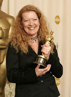 Mike Leigh and Andrea Arnold (both pictured right) were only minorly significant to our project. Happy-Go-Lucky was a very interesting film in it’s depiction of classes and attitudes in modern Britain, especially where Scott (Eddie Marsan) is concerned. He is a weirdly relatable character. He has an ordinary life, an ordinary job, yet his views on the world around him are extreme. However, he is shown in such a way that we do not feel alienated or disgusted by him, but we sympathise for him. Here is a clip illustrating my point, http://www.youtube.com/watch?v=HN_kOED6zGE. At 5:30, when two young black men cycle past the car he tells Poppy to lock her door. It is his view that all blacks are dangerous people and should not be trusted, an extreme view to hold in the modern world. In this way, we also had the challenge of creating relatable characters by:-
• Having recognisable traits of everyday people.
• Have them created through costume and looks that they are normal people.
• Constructing relatable actions and words through dialogue and body language.
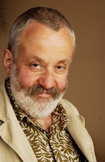 I felt this was an important aspect of social realism; relatability. The characters need to be understood and valued by the audience, so in this way, Mike Leigh inspired me. Andrea Arnold has directed some notable films, which can be read up on here, http://www.imdb.com/name/nm0036349/. After viewing Wasp and a little of Fish Tank, it was clear that Arnold had an eye for sympathetic character construction. Even though the mum from Wasp isn’t exactly a ‘good’ mother, she has redeeming qualities in her. In this way, she inspired me to create imperfect characters. In this way, socially realistic characters are relatable.
 Moving onto foreign films, and I’m incorporating global cinema into this category.
25th Hour is a post-9/11 drama. On the left is a shot sequence of one of the characters in gradually expanding shot lengths. I liked this little sequence because it first emphasises his facial expression, then his body language, so the characters demeanour is visible in each shot, but is developed in each shot. I decided to incorporate this into my storyboard, but with a tower of baked bean cans to have the same effect.


Below are 2 shots. The uppermost one is from Elia Kazan’s 1955 film East of Eden. In the shot James Dean is leaning on a wall unit with angst. A similar shot can be found in Werner Herzog’s drama, Woyzeck, with Klaus Kinski. Both of the characters are in the foreground, and the characters consoling/aggravating are in the background. In this way, they are emphasised emotionally and physically. I used a similar shot in my piece with one character being consoled in the foreground by a character in the background. In this way the accentuated characters emotions are brought to light through the others words.


Although our lighting was underdeveloped, I did research lighting through watching various genres of films. Andrei Tarkovsky’s 1979 film Stalker uses a black and white/sepia tone to create a bleak and nightmarish feel to the film. Characters emotions are heightened by the lighting schematic, without its stylised tone being too deliberate. I couldn’t emulate the lighting from the film, but it did give me something to aspire to. The 2 images on the right show that the artistic lighting is superior compared to the social realist films I’ve mentioned previously, but social realism doesn’t call for dazzling visuals.


His shots of the outdoors are especially brilliant. The 2 shots on the right distill his ‘poetry-in-motion’ visuals that he is famous for. The shots below were inspirational simply for their beauty. Tarkovsky is notable because all of his shots were crafted artistically, rather than practically.


Concerning typical narrative structure, representation, mise en scene, sound, editing, camera work and themes and issues, our film worked with some of these conventions.
Our film stuck to and broke British social realism conventions in the following ways:-
• Representations of male characters – deconstruction. Although the male nature is being broken and explored more now than ever, it is still an underplayed part of many social-realist pieces. Our film deconstructs the male identity; the characters are not hard as nails or granite faced, they are emotionally and physically as volatile as women. In this way we challenged the male psyche.
• With the technical aspects, camera work, sound and editing, we were pretty rigid with our parameters. There were no cuts besides the straight cut. Our camera work was stable and formulaic, and our sound was slightly off kilter due to the hum of the fridge in the background.
• Themes and issues brought up in British cinema include; social classes and their different attitudes, different views between women and men concerning mental and physical structure.
2. How effective is the combination of your main product and your ancillary tasks?
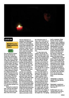
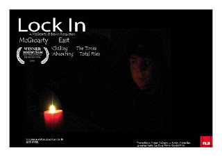 Concerning our main product, the film, with our ancillary tasks, the poster and review, I think all three marry up quite harmoniously. Our poster (pictured) and review (pictured) both reflect the themes of the film. The posters darkness and emptiness fits the depressing nature of the film. With the conventions of British social realism posters, we understood the basic conventions, but didn't opt to use them. We broke common conventions by not using recognizable backgrounds or character types. In fact the poster gives very little away about the films characters. With our review, it had to done in the house style of Little White Lies, so breaking conventions there was imposible because the brief didn't allow it. Here are the conventions we stuck to in the review:-
-Having a single image at the top of the review
-Having the review in 4 columns (although not all reviews are laid out in this way)
-Using complex, film literate language to appeal to LWL target audience
-Having the background as a solid base colour, in our case, white
-Having the films title, release date, stars and directors in different boxes in a particular place on the review
-Using the 3 tier evaluation system at the end of the review to sum up our thoughts and feelings on the piece
-Making references to other films and current affairs
I felt we stuck to these conventions well. Here are some examples from LWL itself. I feel we emulated their style and craft quite successfully. As a unit, I feel our film should be reflected through the words in the review and the visuals in the poster. I think the nature of the film is reflected through the poster somewhat, and its ideological and socio-realistic commentary are present in the review.
3. What have you learned from your audience feedback?
I decided to take a personal approach with the film as people can be too polite over the Internet. Several people who do media in other schools watched my piece. I chose media students because they know how to spot the strengths and weaknesses and solutions for the next project. Below is the feedback from people. I quote them. Their names are alongside their opinion.
-Nick Weatherby - 'The lighting was changing throughout and it didn't work very well with the rest of the film' - 'The dialogue was good, but it didn't lead the story anywhere'
-Chris Vaughan - 'The lighting was not done very well, some of it is too dark to see the facial expressions or anything' - 'I think it could have used some music over the top, like a piano or something, in a sad tone'
-Holly Emery - 'It was dramatic in places, but the lighting just wasn't happening' - The acting was good, but the story was too short, not enough oomph'
-Kevin Moulton - 'Good job, but the lighting really let it down' - 'The story had a focus, but nowhere to go'
-Joe Gordon - 'It was alright, but it drifted too much' - 'Could've used some humour to make the characters seem more realistic'
Our feedback was interesting. Obviously the main thing was lighting. I agree with tehm all. The lighting was poor, and some of the shots are barely visible. Now next time I shoot, I will make sure the lighting is present in each shot. While our location wasn't exactly roomy, it did enable us to light from 1 location, but we didn't exploit it well enough. Lighting is an oft overlooked part of filmmaking to amateurs, so next time I will pay strict attention to it.
Another bone of contention was the lack of depth with the story. Some of them felt it went nowhere. While this is correct, I think this was partly intentional on our part, but magnified by a neutral and critical viewpoint from others. Our sotry didn't really follow the normal 3 stage narrative of films. There was a set up, but no kind of disequilibrium and no resolution, so a film literate audience I got feedback from noticed this. Perhaps next time investing in a proper ending and some kind of disequilibrium would enhance the viewing experience for the audience.
My last point is a mix of music and humour. We felt that having music over the top would ruin the piece, but it seemed to be an underlying trait in most comments. A soft piano would've enhanced the drama, so maybe next time investing some time into putting a good piece of music over the top would increase the drama and hence the overall wellbeing of the film. Joe Gordon made an interesting point when he said the characters should have had more humour; a typical British trait. Even in the face of depression, our humour lives on. This is most potent in films like 'Looking For Eric' or 'Happy-Go Lucky', where humour is contrasted by the dank and realistic tone of the film. Our British humour is never forgotten in the social realism films, so theres something quite big there we overlooked.
4. How did you use new media technologies in the construction, and research, planning and evaluation stages?
‘New media technologies’ includes the digital cameras used, apple mac editing software (i movie or final cut pro), garageband, blogging, social networking sites (if used), indesign, photoshop.
I used a variety of different types of software. Such as:-
-Final Cut Pro
-GarageBand
-XM2 Video Camera
-Blogger
-YouTube
-InDesign
-Photoshop
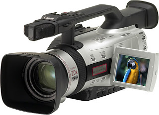
The XM2 is a terrific piece of camera equipment. It is a high quality camera, and is quite a bit larger than regular digital cameras. Here is a picture. It was easy to use, the functions were all easy to find through the on'screen menus, and the recordings were quite clean.
Final Cut Pro is a sophisticated piece of software. I used this instead of iMovie because of its complexity and range of tools. iMovie was too basic, and I found Final Cut a lot easier to use. Editing the footage was a simple process, and the transitions were easy to apply. Here is a video of the basic tools of Final Cut Pro. http://www.youtube.com/watch?v=AVQaP1Kc8NA The cutting tool was clen and efficient, and the layout was good. It enabled easy transition between editing at the beginning to the end of the film. Considering our uploaded footage came in one 31 minute segment, this proved invaluable.
Blogger was essential. It enabled us to post our thoughts on filming, general progression and ideas for the main and ancillary tasks. Blogger has an easy to navigate format, and the layout is agreeable. You can post as many entries as you like, and you can insert hyperlinks, pictures and video, so the blog is multimedia, something that helped our criteria for this project.
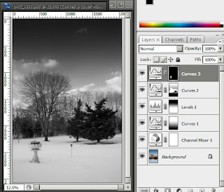
InDesign and Photoshop are quite similar pieces of software. Tom used photoshop for the poster while I used InDesign for the review. I found InDesign had more options and was easier to naviagte and find tools. Here is a screenshot of photoshop in action. Here is a tutorial of InDesign. http://www.youtube.com/watch?v=0hPni_N3jtQ It ciovers the use of feathering, something I had to use myself. You can get a general feel for InDesign from the tutorial.
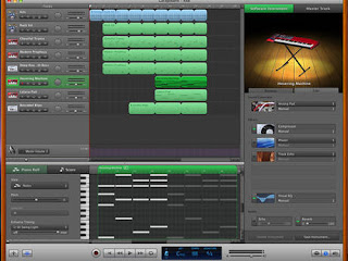
I didn't actually use GarageBand that is in the finished product, but I did explore some possibilities in the software. The use of sound effects and stark music was interesting, but ultimately nothing came from it. Here is a screen grab from GarageBand.
