Here is my first draft review in the style of LWL.
The apocalypse has always been a bleak landscape; everything from Mad Max to Stalker has had a raging undertone of human loss, despair and hatred. An operatic distortion of our reality that is simultaneously vile yet absorbing. Wide plains of the silent promise of loneliness that stretches into our minds. It accentuates human nature so it's desperate plight for survival and safety is so shocking it grounds us as we watch.
Bearing this in mind; the tears, cruel eyes and soulless faces, we come to Lock In. The most curious part of the film is that it lets us know exactly what has happened, without the painful obviousness of the traditional nuclear bomb explosion or the withered trees and streets of yesteryear. It opens with a collection of eerie shots - grimy walls, a hatch that represents the pitiful hope of escape, juxtaposed with with the impossible insanity of facing an unknown threat. Ultimately, that is the logic the characters dare not transpire. Trapped in their makeshift dungeon, pleading with themselves to leave. In the end, such bold courage does not appear, and the fear of the unknown is mulled over by the only two characters, Harry and James.
The two are brothers, and they are accompanied by Lucy, their young sister, who remains an unseen and polarised figure to them. The fear stems from their father leaving, looking for survivors. We are not given a glimpse of his uncertain situation, although we are not offered hope in the slightest. The main part of the film lies in the heart of the conversation the brothers have. At times painfully disparate and brutally melancholic, the characters have an air of ebbing frustration eating away at them every time the other retorts. We can tell they are worn down by their circumstances; never more so than the violent physicality of James, who's coiled viper act contrasts with an earlier, lost rambling child pantomime. In contrast, Harry is a level-headed, stable character, although his mental flaws are exploited by his very longing for the truth.
It is here, that we, the audience, become torn. We feel the torment of their isolation, yet we urge them to step outside with a grand panache. We can't help but think that there both a little cowardly. Obviously in the absence of their father they have had to play an ever-burgeoning role of the father to Lucy, but it is also clear that she is as much a responsibility as an excuse.
Their increasing vicinity to each others natures is enhanced by the stillness of the camera. The framing is compact, nothing is left to waste. While you could say the cameras statue like quality is a let-down, its lack of kineticism perfectly mirrors the obliterating depression and solitude in the cellar they dwell within. The table is lit by a single candle, and while this shining beacon could be perceived as a ray of hope, it's more a constant reminder of the brighter days. The lighting itself is contentious. While the drab, low-key lighting schematic works to emphasise the dreary setting and mindset, one can't help but feel a little underwhelmed by its plainness. However, producing a stylised, chiaroscuro lighting would have downplayed the foulness of the whole piece; the construct of male fear and cowardice, the constant surreptitious hopelessness or the volatile nature of the human being.
Anticipation: an unknown quantity. First time directors collaborate. 2
Enjoyment: as good an expression of the gradual loss of soul as any. 4
In Retrospect: not a conversation starter, but still an emotional glass tank. 3
Word Count = 598
Posted by Michael McGroarty
Monday, 29 March 2010

Friday, 26 March 2010
Review and posters. - Thomas Brown
Well after a hectic rush this week we have managed to get most of what we need to do done. The poster is ready as is the film, And expect to see the Review posted up by Michael very soon, I will post the decided poster with Analysis. The Evaluation of our finished product should be complete soon.
Thursday, 25 March 2010
Finished poster - Thomas Brown & Michael McGroarty
 new
new
This is the poster that me and McGroarty have decided upon, I created it in InDesign with some slight work in Photoshop as well. I decided to keep with the theme of keeping most of the poster clear with the darkness, in order to extend the feeling of loneliness. We also decided to combine the awards because it created less clutter. Our initial thoughts was that the top left corner was too cluttered, but when we looked at the poster as a whole, rather than concentrating solely on the title etc, it contrasts quite well with the darkness of the image. The award we decided to incorporate in was at the Edinburgh Festival, and we settled on just the one award because otherwise the poster would become too cluttered. We just need to include a credits block at the bottom, and maybe put in another funding company.
I have now updated this post with a new poster, featuring new fonts and a new screen-block which credits everybody involved with the film.
Concerning our choices regarding the poster, we felt the element of simplicity matched up with the basic premise of the film. Obviously we're making a socially realistic post-apocalyptic drama, so a flashy or overindulgent poster wouldn't marry up with our target audience. The single image of the lone figure drenched in darkness retains a lonely yet mysterious edge. It is also quite a powerful image; as stark as it is real. The use of white for the title, actors etc was made to contrast with the darkness of the main and only image. As for the font itself, we chose it because it seems to be crumbling and broken, which we felt worked well with our genre choice. We chose to include Film4 as a funding company because they do promote and fund small films, which fits in with our film very well.
Second Time Editing - Michael McGroarty
We uploaded our re-shot footage into Final Cut Pro; unfortunately it uploaded in one massive 31 minute clip, which meant that we had to go through the process of cutting it up, and deleting the parts we couldn't use. Through a combination of our efforts, it took about 3 hours to cut the footage down to about 10 minutes. After this initial setback, it was a simple task of using the best shots. We filmed in sequence, so piecing together the clips was easy. As we have a lack of camera movement, I wanted to have as much match-on-action as possible. Therefore, rather than having a cut at the end of each line, I cut between two shots mid sentence. Initially this proved tricky, as this is quite difficult to do without spoiling the natural flow of the dialogue. However, after several cuts, I had created a good dialogue match over 2 cuts. There was some trouble when an essential shot hadn't been filmed; there was footage at the beginning and at the end of the scene, but no actual footage of it. It involved me sweeping away the bottle-caps and having my head in my hands. The first take, after I swept away the caps, I got up and walked to the wall. However, we realised it'd be too difficult to film from the new position, so we decided to have me put my hands over my head. This shot was the one missing. To avert this disaster, I cut off a short clip of the other actor, and put it in after the take of me just about to get up. I cut early, and dragged the sound over to the reaction shot, so the sound continuity was good, and you don't see me walk away, so the physical continuity was good. The edited footage ran to 3 minutes 16 seconds. This wasn't too short; our last footage ran to 2 and a half minutes.
I kept the dialogue snappy. Some of the takes dragged towards the end, the pauses were too rigid, too thought over. It didn't have the realistic flow of a conversation. So I cut it down, made it sharper. We opted not to have a soundtrack, and we didn't need to add in any diegetic noise, so the use of GarageBand was obselete. We completed the editing in around 6 hours.
Posted by Michael McGroarty
I kept the dialogue snappy. Some of the takes dragged towards the end, the pauses were too rigid, too thought over. It didn't have the realistic flow of a conversation. So I cut it down, made it sharper. We opted not to have a soundtrack, and we didn't need to add in any diegetic noise, so the use of GarageBand was obselete. We completed the editing in around 6 hours.
Posted by Michael McGroarty
Wednesday, 24 March 2010
Little White Lies review examples - Thomas Brown
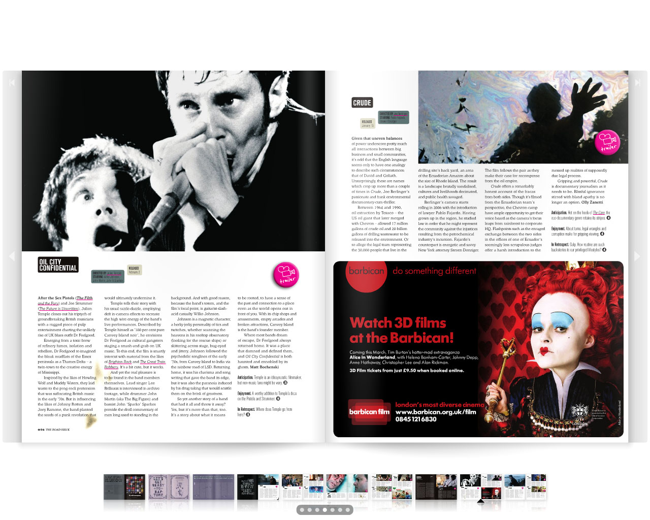

Here are some examples of Little White Lies reviews which feature their very specific design of each issue. The issue in use here is The Road (2009) issue, taken from the on-line site. The dirt and drab pages are representative of the post apocalyptic nature of The Road. We hope to follow this style in our own review. There numerous doodles and old-age guilds that are on the pages are representative of the post-apocalyptic nature of the film.
Tuesday, 23 March 2010
Lock in poster - Thomas Brown
 new
new

These are my more reviewed suggestions for the poster.
I Personally prefer the 2nd upload, As it Gives the image more space and adds to the lonely emphasis of the picture.
I will collaborate with Michael to decide upon a final product which we will then produce.
EDIT: I have added a new poster using a different font.
LwLies Layout. - Thomas Brown
 Above is a basic wireframe layout of a Little White Lies review, They all follow a very similar style, with the image covering 3 or 4 of the columns, usually 4 on the full page reviews. We have decided to include a doodle to fit with the style of whichever copy is out at the time of printing, Currently this is the Kick-Ass Issue.
Subscribe to:
Posts (Atom)
